
We are excited to introduce the Drawing and the 3D viewer, two powerful components designed to bring your visual data to life. We have also rolled out a completely redesigned Imports interface.
Main features
Drawing component
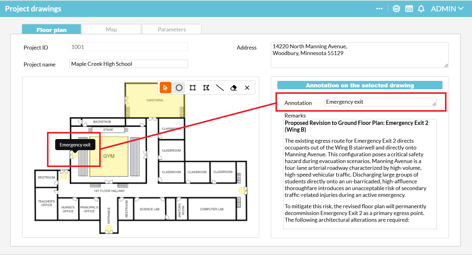
Users can now sketch and add context directly onto images, PDF (first page only) and DXF CAD files, turning static visuals into interactive canvases where pins, rectangles, polygons, or lines can be drawn to highlight areas of interest, then bind information to those shapes. It is perfect for construction teams marking up blueprints and architectural floor plans, but versatile enough for adding visual context to any report or document.
3D Viewer
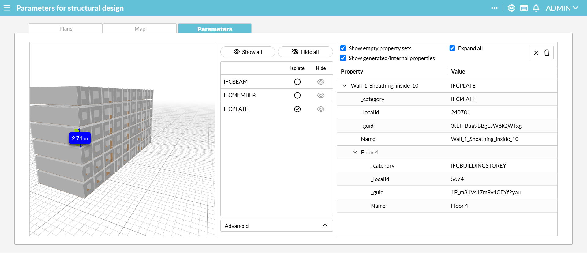
You can now view 3D models directly in your workspace without installing extra software.
Whether you are working with architectural BIM data (IFC), web graphics (GLB/GLTF), or 3D printing files (STL/3MF/OBJ), you can now open, rotate, and inspect your models instantly. Simply upload any common 3D file type to get started.
Imports new user interface
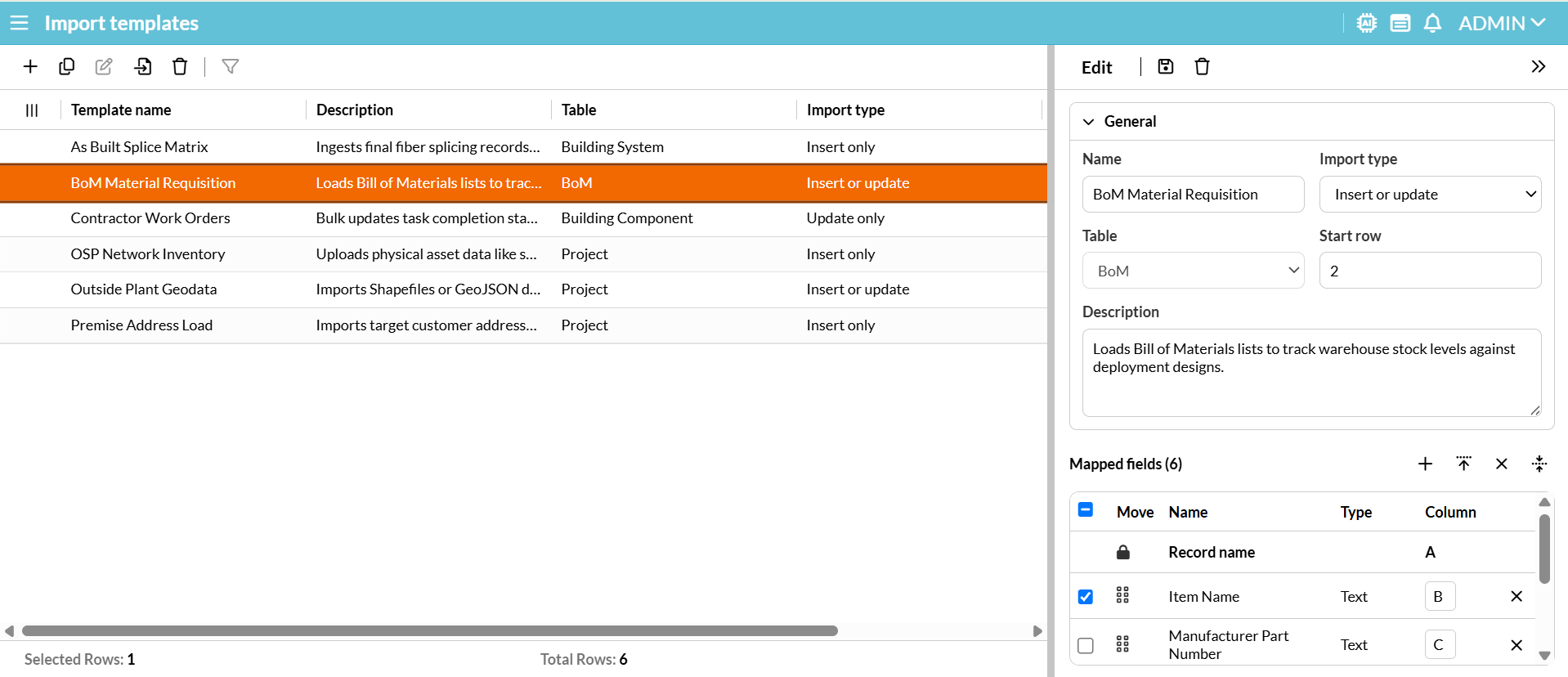
The feature formerly known as Import Configuration has a brand-new look and a new name: Import Templates. While the new name better reflects how you reuse your setups, the interface itself has been completely rebuilt. It now uses the same column-and-row structure as the recently launched Reports Manager, making it much easier to navigate and manage.
Improvements for end users
Notifications displays
In addition to standard popups, Notifications can now be displayed as follows, depending on your administrator’s configuration:
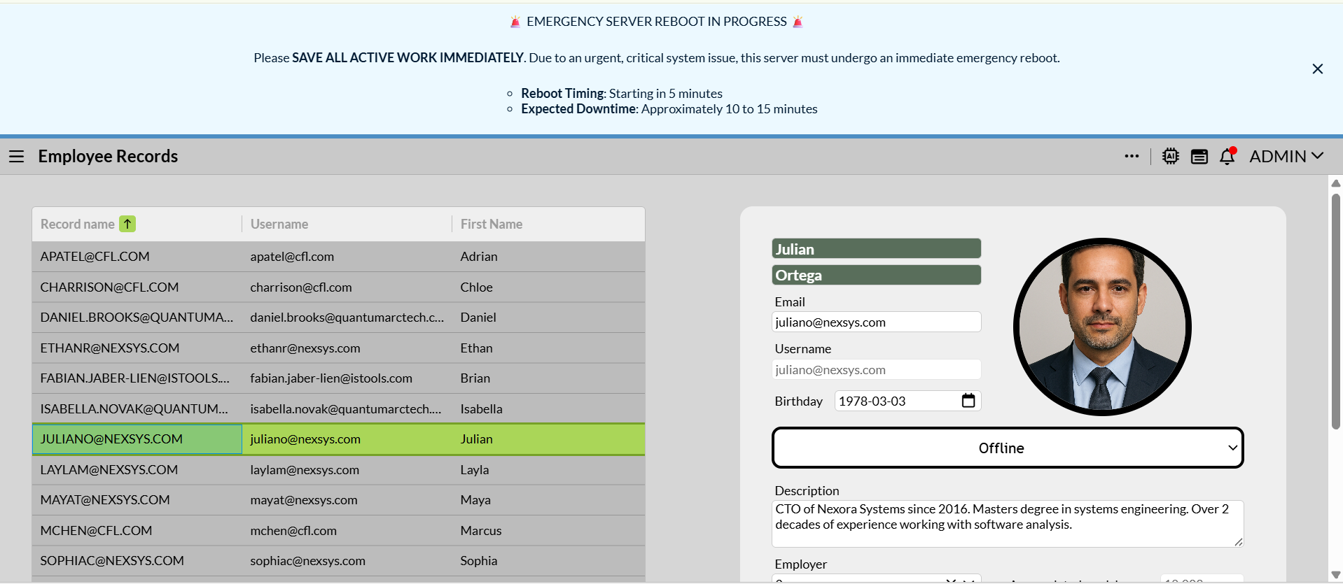
- Top banner: For high-priority alerts, a sleek banner at the top of the screen instead of a disruptive popup.
- Bell icon only: Low-priority updates can be quietly routed directly to the notification bell to prevent workflow interruptions.
- Time stamps: Notifications listed under this icon now show how long ago they were received (e.g., 2d, 1h).
Authentication via OpenID Connect (OIDC)
We have introduced a modern, secure, and standardized authentication mechanism. Both API consumers and regular users can now authenticate seamlessly using OpenID Connect (OIDC), unifying your security architecture and streamlining the sign-in experience.
Improvements to Reports
Quick template link: You no longer need to use the main menu or the Quick navigate tool to return to the Report Manager after downloading a report. Simply click the new link on the Template Name inside the Report Queue form to jump straight back.
Custom Field Sorting: When configuring a report template, you can now set a Sort Direction (ascending or descending) for individual fields to organize your data exactly how you need it.
Report macro files: We have simplified navigation by integrating the Report macro files form directly into the Report manager toolbar. This removes the need for a separate form within the menu’s Report folder, giving you quicker access to your macro files right where you manage reports.
Enforcing unsaved changes warning
Previously, if you edited a record in the Detail or Multi-Detail section and navigated away, confirming the “Unsaved changes” warning modal did not actually clear your edits if you returned to the record. We have updated this behavior: Confirming the prompt now properly discards all unsaved modifications prior to leaving the page.
Bugs fixed
Variables are now case-insensitive
We fixed an issue where variables were incorrectly treated as case-sensitive (e.g., treating @param and @Param as two different variables). Variables are now strictly case-insensitive, matching our official documentation.
⚠️ Action Required: If you previously created duplicate variables using different casing, they will now conflict. Please review your configurations to ensure you do not have overlapping variable names.
Form designer:
- The :hidden IQL Behavior property failed to work when combined with Active Record field conditions in limited Detail and Multi-Detail sections.
- The @limitByValues variable (used to filter based on selected Table section rows ) was incorrectly suggested as @limitByRecords in Form rules.
- The Panel Caption property had a visual mismatch between Form Designer and runtime.
- The Datasource property for the Multi-value component was not highlighted in red to indicate it is a mandatory field.
- Required fields were missing their validation highlighting in the Map layer editor.
Reports:
- Following the removal of classic forms in a previous release, active links in generated HTML reports no longer function. To resolve this, we will update the system to stop rendering these links entirely.
- An error occurred when trying to delete a newly created, unsaved report.
Rules:
- Schedule rule validation failed for conditions set on Date fields during execution.
- In the ‘Send a mail’ rule action, the Importance setting reset back to Normal after saving, and Normal was incorrectly interpreted as High on the actual email.
User administration:
- Pasting copied cells within this form caused an error message.
- The Password policy column could not be filtered.
Forms:
- Maps
- This component would unexpectedly shift away from the selected location marker after reloading data via advanced fixed filter.
- Its content did not scale when hiding the side menu on the screen.
- An error occurred when loading a Map limited by a Selector record with missing coordinates.
- Adding and saving an empty array of coordinates to a GeoJson field prevented other coordinates from rendering in the Map layer.
- Table section
- The Summary row aggregation feature counted all records even though no rows were displayed when the Table section was limited by another section with no record selected.
- Copy-pasting a Note field table column failed if the text contained line breaks or newlines.
- Mandatory Relation fields displayed a visual defect of a double red border.
- Text color failed to apply.
- Other
- The Shift+Enter keybinding stopped working for inserting newlines in Note fields.
- Tooltips did not appear when hovering over disabled Button components.
- Ctrl+clicking a Link component triggered an error if the openUrl() function included a concatenated parameter.
- File uploads were blocked due to the “File upload is not supported in dry run mode” error related to the Toggle rule debug tool.
- An error occurred when changing a field value in a rendered form configured to copy File fields via Run on change.
- The Calendar component rendered the Save button as enabled, despite being disabled in Form Designer.
- An error occurred when rendering a form containing a Link component whose Form Rules contained only comments.
Other:
- The ‘List / Parent table’ column of the Data model editor was missing an automatic vertical scrollbar when the list became long.
- Automatic Imports completion e-mails contained indexed placeholders instead of actual data.
- In the menu header, the ‘Switch application’ option was unavailable after users changed their password.
- Notifications were not sorted chronologically.
- Awen AI Assistant resized incorrectly upon the first launch.
- Text could not be formatted as bold and italic at the same time, e.g., ***bold and italic*** in forms, e-mails and notifications.
Changes for administrators
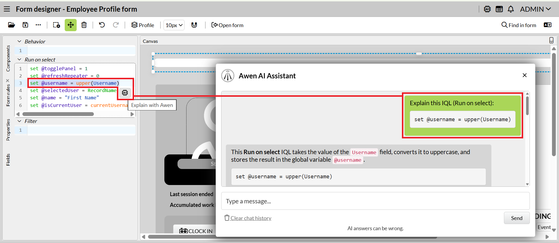
Explain with Awen
We have integrated our AI Assistant directly into all IQL editors across the Form Designer and the Rules Manager. Instead of writing prompts from scratch, simply highlight any text and click on Awen to get an instant explanation. Troubleshooting and writing queries just got faster and easier.
Form designer – Dynamic Form Layout
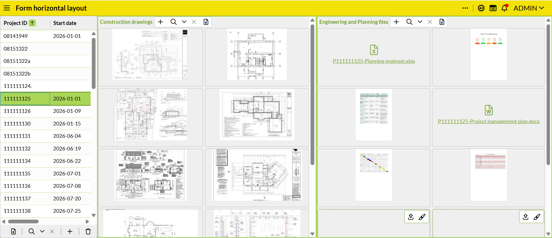
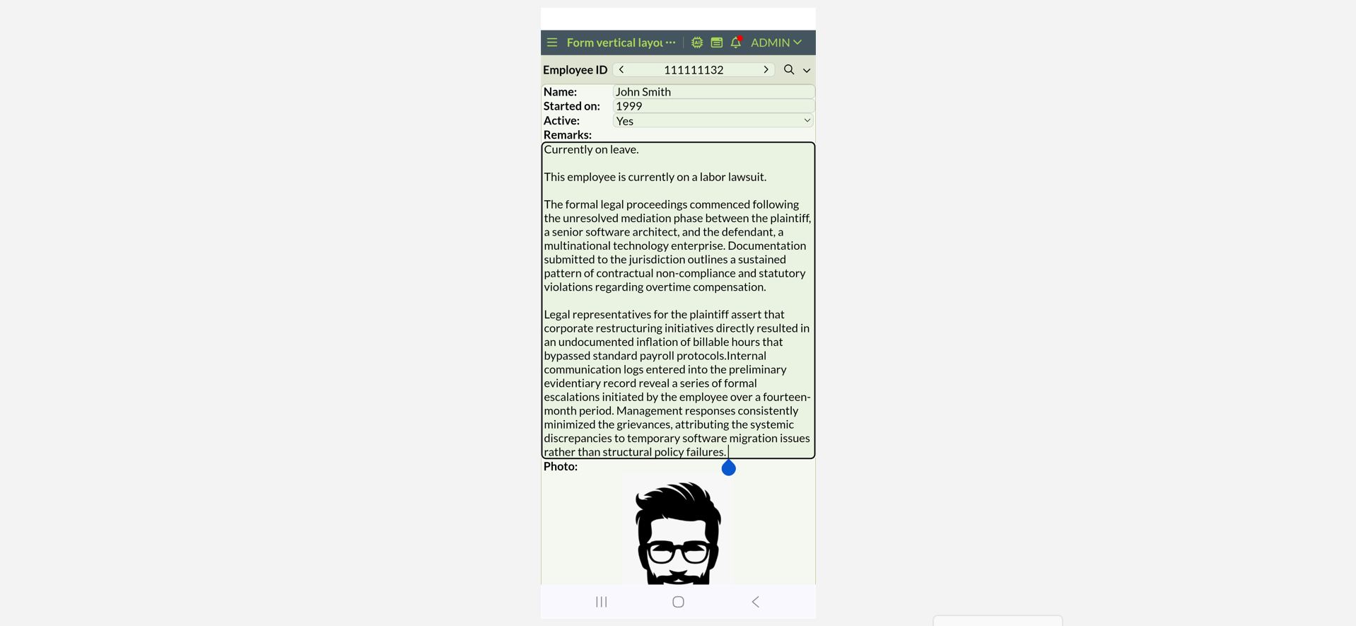
We have introduced stack layouts, a dynamic layout engine that automatically arranges form components sequentially. Unlike classic positioning which relies on rigid coordinates, stack layouts automatically adapt your forms to changing screen sizes.
- Flexible layouts: Organize forms using ‘Stack vertically’ for seamless mobile and tablet scrolling, or ‘Stack horizontally’ for wider monitors.
- Smart Sizing: Use Fill to stretch components across the remaining workspace, Hug to perfectly shrink-wrap components around their inner content, or Fixed for exact pixel sizes.
- Responsive row wrapping: Enable ‘Wrap rows’ to let horizontal components drop cleanly to new lines on smaller screens. Forms automatically flatten into a clean, single column when viewed on mobile phones.
- Expanding Note field: Combine the Hug dimension with formatted Note fields to create text containers that automatically expand in real time as users type.
- Responsive autofill for Repeater: Allows you to build flexible data and image grids without manually defining column or row counts. Instead of using rigid grid dimensions, the containers automatically scale and wrap to perfectly match the user’s available screen size.
⚠️ Warning: Please be aware that the new layout feature is an ongoing development effort spanning multiple releases. Because we are releasing it early to collect user feedback, future updates may alter or impact your current configurations. We strongly recommend against deploying this functionality for business-critical features right now. We do, however, invite you to explore the tool and provide feedback to help shape its future.
Other improvements to Form designer
Form saving workflow: To prevent your menu from getting cluttered with draft forms, saving a new form will now trigger a ‘Save new form as’ prompt. This allows you to choose exactly where the form goes—either organize it directly into a specific menu folder or opt out of adding it to the menu entirely.
Form Usage Analytics: Want to know how often your forms are actually being used? To help you clean up unused forms and prioritize updates for your most popular ones, you can now view usage data directly in the Open Form window. See exactly when a form was last loaded, along with its total usage count over the last week, month, and year.
‘Find in form’ enhancement: Search results for functions like openForm(), openRelated(), and openUrl(createFormUrl()) now display the Form Name instead of the Form ID, making it much easier to identify forms at a glance.
Changes on Property panel:
- Independent border settings: The Border width and Radius settings are now expandable properties that allow you to apply values to the Top, Bottom, Right, and Left borders separately. This gives you granular control over element styling without affecting all sides uniformly.
- Multi-field sorting: You can now configure sorting by multiple fields simultaneously within the Selector component, Charts, Table, Repeater and Multi detail sections, giving you much finer control over how your data is displayed.
- Relocation: The Buttons placement property has been moved under Buttons for better organization. It has also been converted into a drop-down menu with Right and Left
- Removal: The ‘URL parameter for selected record’ setting has been removed from the Table section; this is no longer needed since Form rules can manage this functionality.
Data model editor
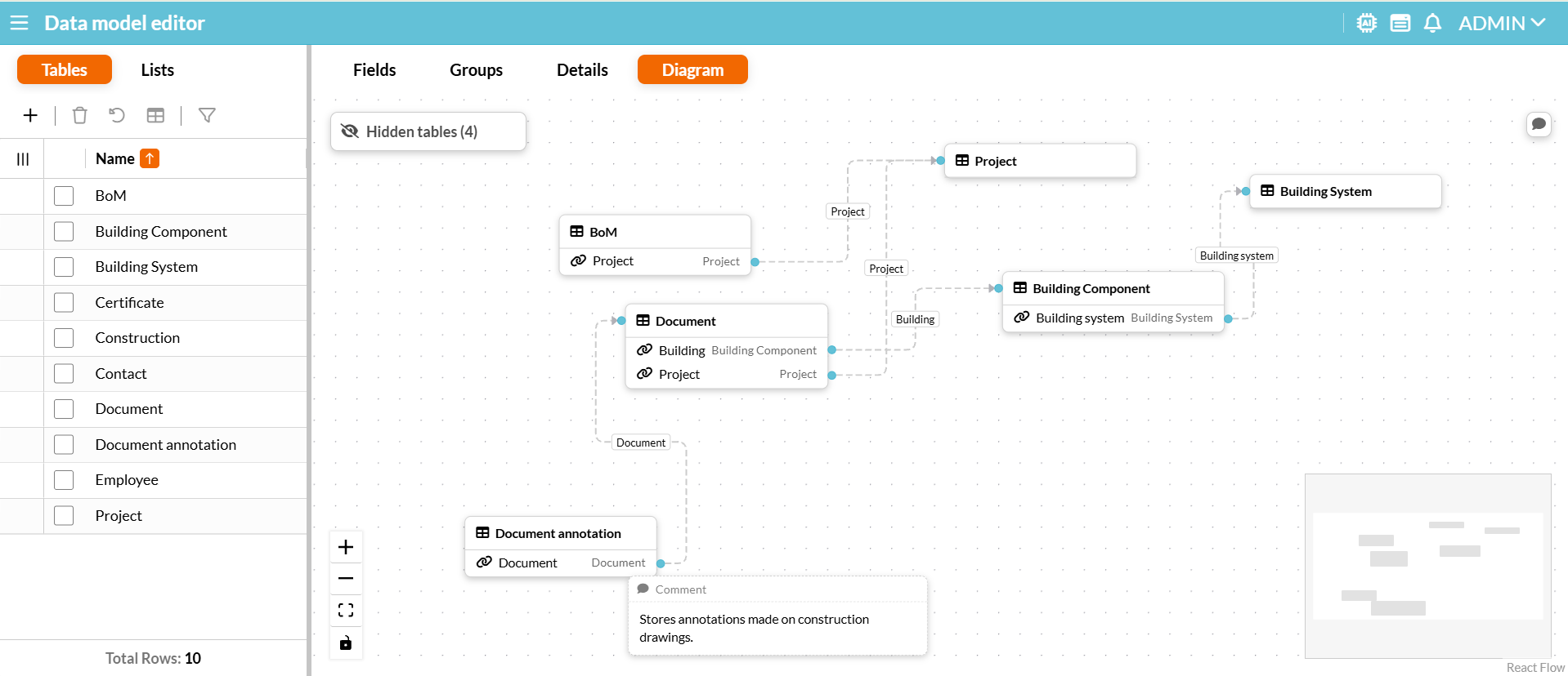
Redesigned Diagram user interface: We have completely updated the Diagram tab to provide a highly detailed, customizable view of your data architecture. You can now see all relations listed clearly under each table, easily zoom or fit the view, and toggle interactivity. Plus, you can now show or hide specific tables so you can focus exactly on what you need to see.
Updated Relation field property: The ‘Delete constraint’ setting for Relation fields has been renamed to ‘On delete’ and now offers three distinct options:
- Clear: Lets you delete the parent record even if relationships exist, leading to orphan records (replaces the previous Null checkbox feature).
- Restricted delete: Prevents the parent record from being deleted if relationships exist (replaces the previous Checked option).
- Cascade delete (New): Automatically deletes all child records when the parent record is deleted.
⚠️ Important Note: Editing the ‘On delete’ property is not currently registered in the Activity log form. However, records removed via ‘Cascade delete’ are registered in the Logged data search form for tables with the ‘Log changes’ enabled.
Menu icon upgrade and reset
Configuration bundles
Dependency tagging: Items added via the ‘Select dependencies’ button will now display a green ‘Dependency’ tag. Manually added items will not have this tag. This visual distinction simplifies troubleshooting by helping you differentiate between your local application changes and imported dependencies.
Enhanced Action Locking & Loading State: We have implemented comprehensive UI locks and visual feedback during long-running configuration bundle operations.
- Visual Feedback: The Select dependencies, Download, and Save buttons now display a loading spinner and disable themselves while processing.
- Action Safeguards: While a dependency lookup, download, or save is actively running, all secondary actions that could alter your selection are temporarily disabled.
- Post-Save States: After a successful save, the imported bundle remains visible for your review, but the Save button stays disabled to prevent accidental duplicate postings. If a save fails before the server import completes, the button is automatically re-enabled so you can retry.
Rule debug tool – Click-to-copy variable values
You can now quickly copy the exact values allocated to variables or parameters simply by clicking them within the IQL tree under the ‘Rule execution graph’ tab. This makes it effortless to grab accurate runtime data for testing and troubleshooting.
Theme designer – Panel border width
The new ‘Panel border width’ control sets a standardized width for all borders on panels and sections, removing the need for manual, element-by-element styling, enforcing visual consistency in your UI.
Activity log form – Expanded coverage
To improve audit capabilities, the Activity Log now captures changes in the Rules editor. It also expands coverage for the Rules manager, automatically tracking rule group creation, configuration modifications, and group membership assignments.
Related to IQL
Form rules
3D Viewer parameter: To optimize BIM data extraction, the 3D Viewer now supports a ‘Selection parameter’. When visual elements in an IFC or common 3D file are selected, their geometry metadata is automatically retrieved into this parameter. This allows administrators to utilize JSONPath expressions to use the 3D Viewer as a selector or to selectively query, filter, and populate relational data tables.
Tuples: We have added support for Tuples directly inside Form rules to simplify conditional logic. This update enables rules to compare sets of values concurrently, such as checking if (price, product) = (5000, ‘Product A’) to trigger an action or a behavior, greatly reducing the code needed for multi-field validations.
Opening links: We have standardized the behavior of the openUrl() function so that all links now open in a new tab, replacing the previous behavior where internal IS Tools forms opened in the same window unlike external websites opened in a new tab. If you have workflows where a URL must open within the same tab, please update your configurations to use the navigateToUrl() function instead.
Selector behavior: New properties have been added to style the Selector component and its content.
- :backgroundColor and :textColor for the component, i.e., selected item.
- :itemBackgroundColor and :itemTextColor for the expanded items.
Header behavior: We have enhanced Table sections so that columns now feature independent configuration behavior for their headers and their cell content.
Rules
Editing in preview: You can now edit your IQL rules directly within the preview pane, making quick modifications significantly easier. The Rule manager still keeps the option to expand the full editor window whenever you need to work on larger or more complex rule changes.
Embedded form links: We have added support for the new createFormUrl() function, enabling you to generate dynamic hyperlinks for use across the platform. These hyperlinks can be embedded directly into the bodies of notifications and emails, as well as within formatted Note fields to create a more integrated user experience.
RestAPI
HTTP PATCH method: We have added support for the HTTP PATCH method within our Rest API capabilities. This enhancement allows administrators developing IQL code to successfully execute API calls to external web services and third-party systems that strictly require the PATCH method for data updates.
restApiGetFile(): Previously, our Rest API functions were limited to returning text-based data. We have expanded these capabilities by introducing the new restapigetfile() function, which allows you to seamlessly fetch images and binary files from external servers. For example, you can now retrieve a file directly into a variable using a rule like let (@file) = restapigetfile(‘fileserver’, ‘/images/file.jpg’) and assign it directly to a form field.